The Brief.
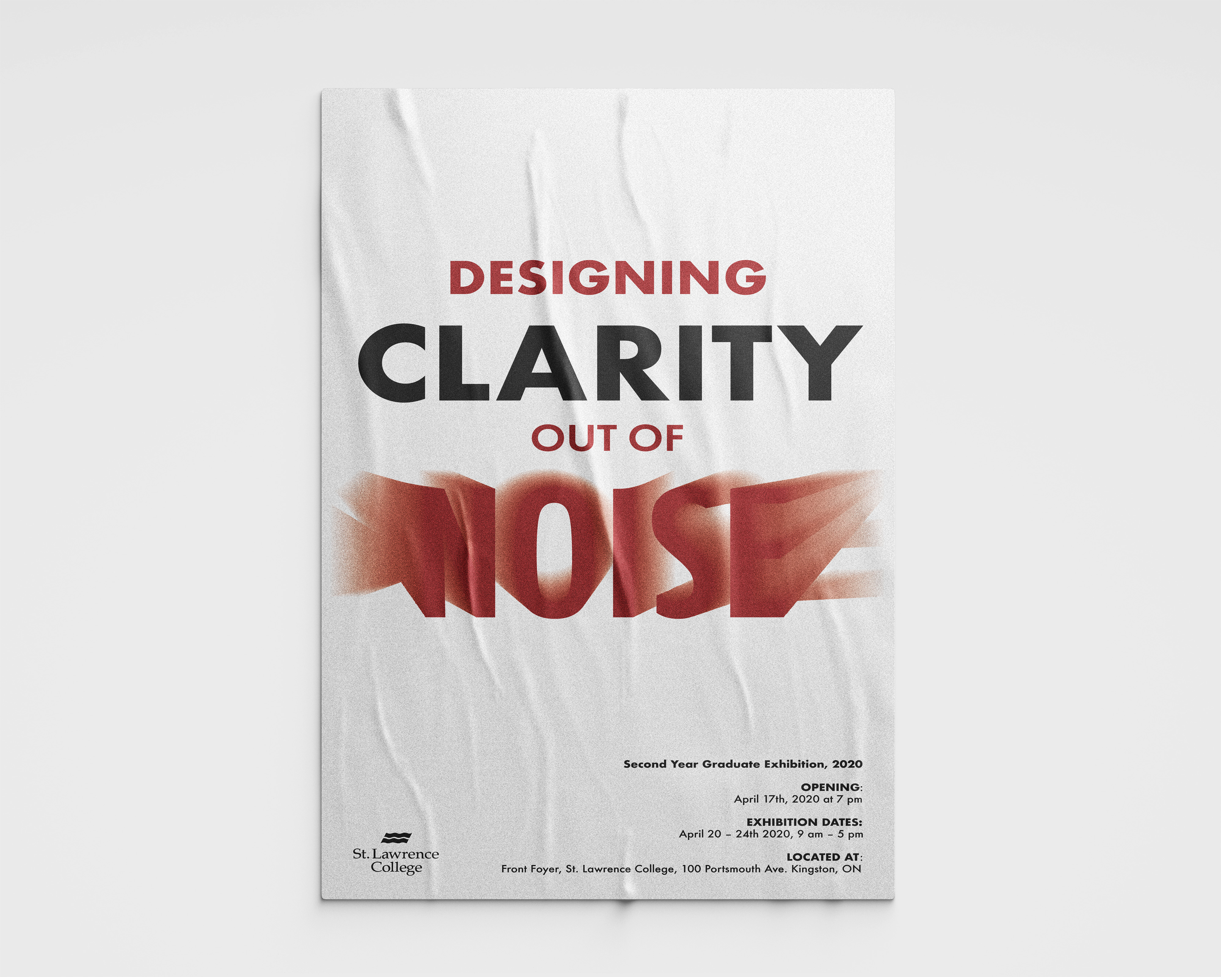
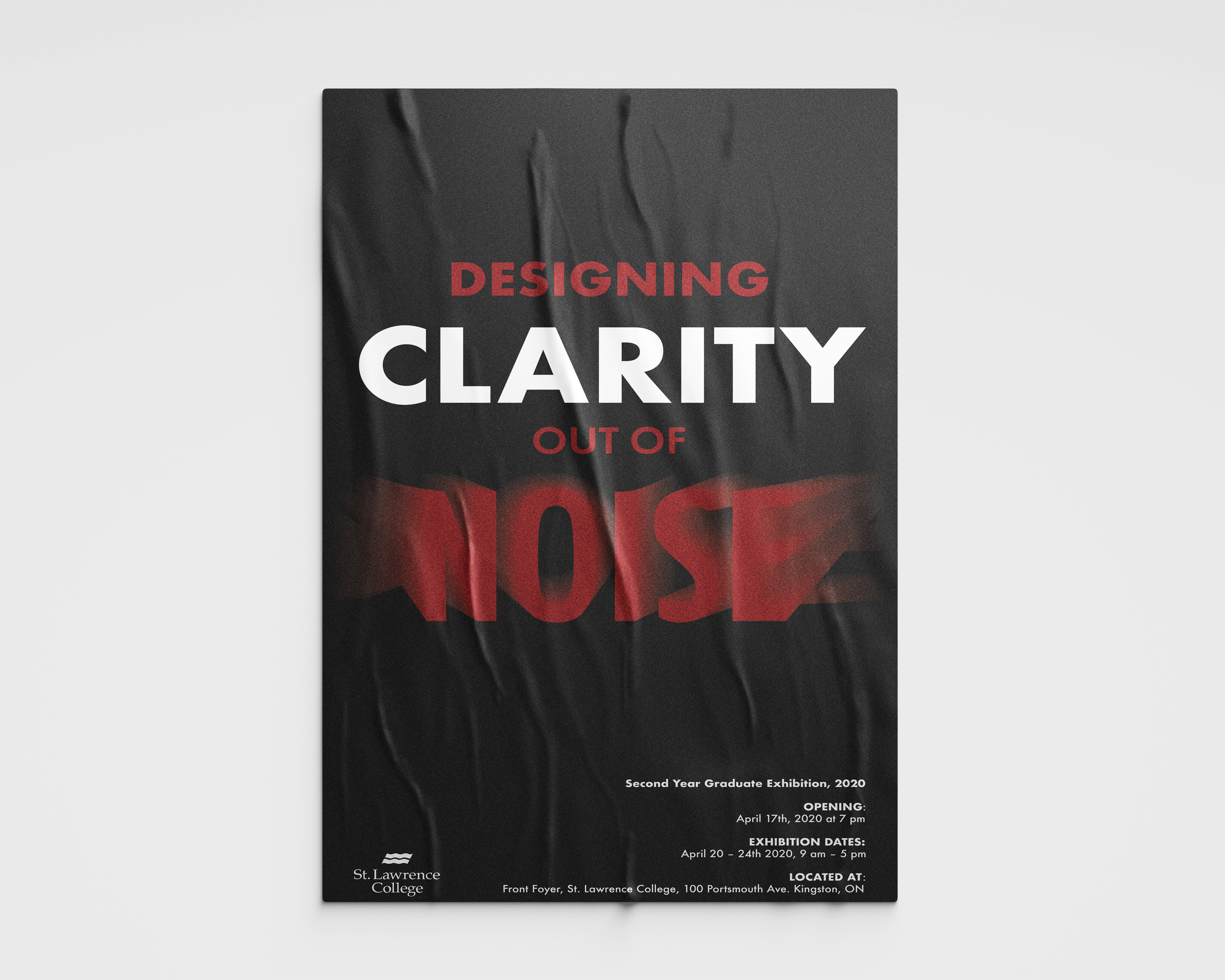
The purpose of this school project was to promote the 2020 St. Lawrence College 2nd Year Graphic Design Student Exhibition which featured the work of myself and my classmates from your last 2 years of study at that time.
The Thought Process.
I generated two versions of the poster with the same colour scheme utilized in different ways. The colour scheme consists of red, black, and white. This colour scheme is used to maintain the branding of St. Lawrence College. The red and the black show high contrast from the white background which really allows the colours to stand out.
The poster had to follow a golden ratio layout. The main text was centre-aligned into the first half of the 8.5×14 sized page, this is to demand the attention of your eyes making it the first thing you see. The main text is followed up by having the event information right-aligned to the bottom right-hand side of the page which will be the second most demanding information that your eyes will go directly to due to the golden ratio. On the left bottom side, the St. Lawrence college logo will be displayed to show the person that is reading the poster that it is an official poster. This will show authenticity and the reader will take it more seriously and will influence their decision to consider attending the event.


