The Brief.
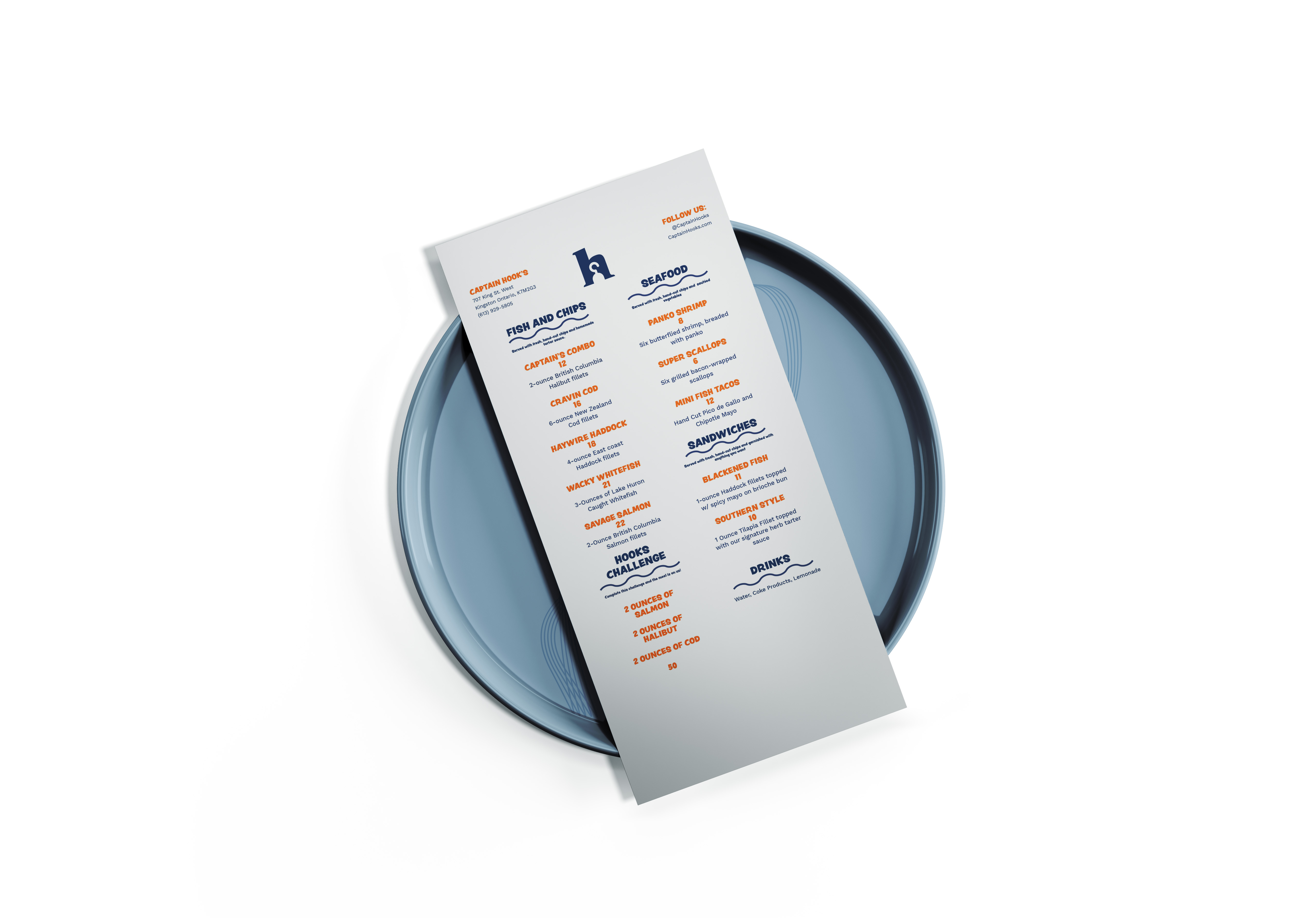
The purpose of this project was to create a menu, menu cover, and logo for Captain Hook’s fish and chips, which is a local food truck in the Kingston, Ontario area.
The Thought Process.
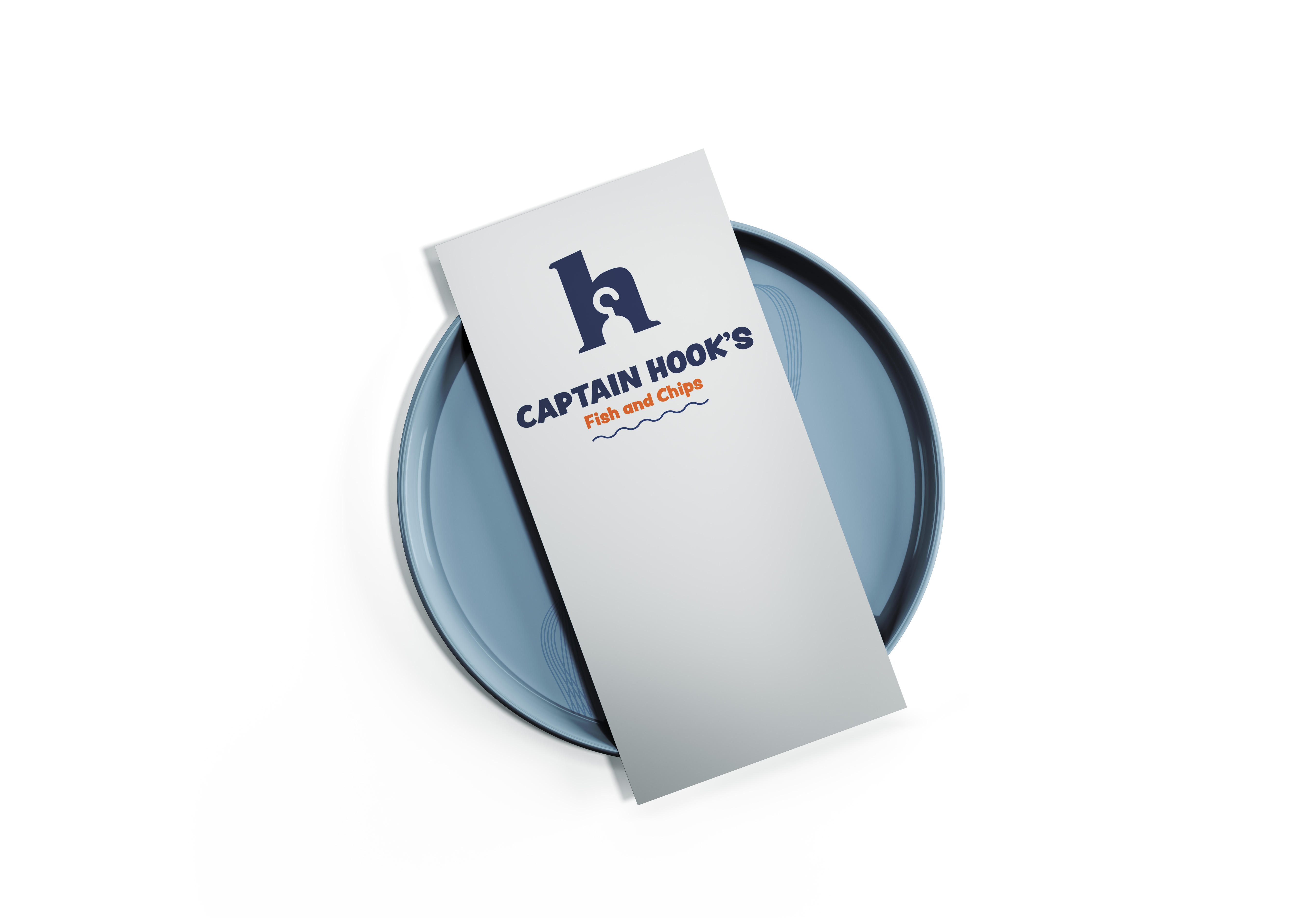
The two colours used throughout the documents were PANTONE 288 C, and PANTONE 151 C. These two colours (orange and blue) both complementary colours to each other. These were used because the deep blue resembles that of the deep sea and the orange which is a vibrant colour was used to contrast the blue which allows you to easily distinguish from the headings on the menu and the contents. The design of the menu is straight forward and eye-catching. It only features the menus logo with a small rule that resembles a wave underneath the text “Fish and Chips”. The rule is also used on the menu itself to keep the theme of the sea. At the top of the menu, it features the business name and information on the top left. The information is made smaller, so it is not a distraction to the rest of the menu and is intended to be viewed as a secondary source. On the right-hand side, there is the “follow us” section. This is also secondary but allows the viewer to gain more information about the food truck itself for self-promotion. The rest of the menu is divided into 2 columns. Each category of food is highlighted by having a higher pt. size type followed up with a rule underneath which leads the viewer’s eyes down the page at all the options.


