The Brief.
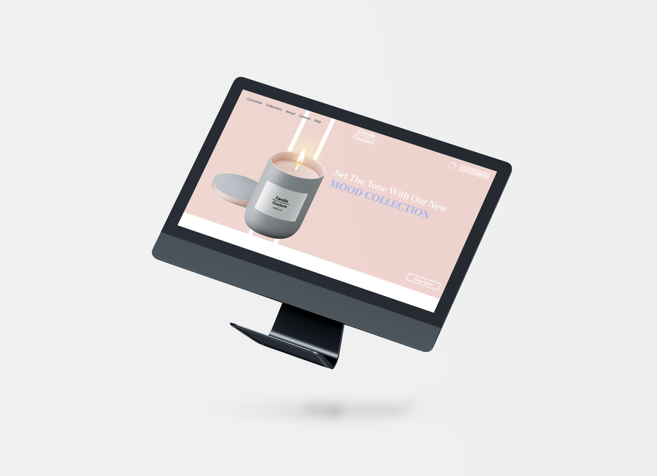
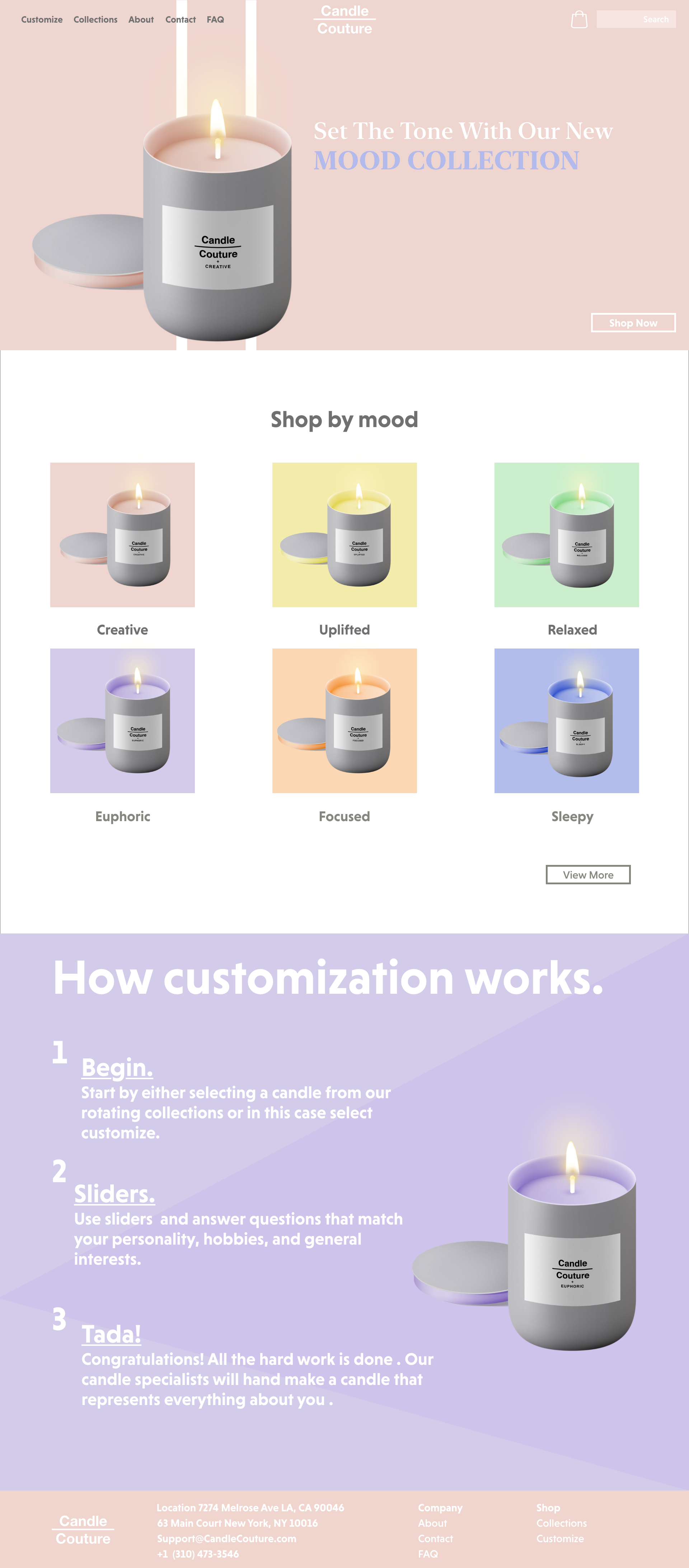
This project was aimed towards creating a responsive e-commerce website UI which had to include a home page and product listing as well as a shipping form solely on a mobile breakpoint. Later, I designed a e-commerce email for the company in another class and included it. We first had to base the company on an existing one but create a new brand as a whole. The company that I based this UI on was Bath & Body Works.
The Thought Process.
Candle Couture resembles the brand identity of Bath & Body Works because of its Colour choices, Audience, and UI design. The colours choices of not only the candles at Candle Couture but also the colours of the website reflect that of what bath and body works would have, including various colours from around the colour spectrum which allows the consumer to incorporate these candles within their interior decorating. The target audience was researched by creating a persona analysis which gave me the information on who my target audience was and what were their needs and hobbies. This helped me understand their needs when developing the site. The UI of bath and body works gave me enough information on how the site was structured and why it worked. I developed the Navigation bar with the search and shopping bag in the top right because it is important for the consumer to be able to view what’s currently in their bag and how much it costs and any given point. The search bar is also important because it allows the user to be able to search up any product that they might already have liked so they can quickly purchase more. The layout was created with minimalism in mind so that the user does not get distracted and confused when accessing the site. All products are listed in a grid view with the products photo as the main focal point.


